

Which Colors Should You Use When Staging Your Home?
If you’re planning to sell your home sometime soon, it’s time to start prepping your home for the prospective buyers who will visit. Even before you take your first photo of your home and post it up on your listing, your home should be appropriately staged for the market you live in.
It’s been shown time and time again that homes that are staged effectively sell faster and for more money than those that have not been given the same amount of attention. Consider these facts, according to the National Association of Realtors (NAR):
- 40% of buyers are more willing to visit a staged home they viewed online;
- 77% of buyers are better able to visualize themselves living a property that’s been staged;
- One-third of buyers offer 1% to 5% more for staged homes;
- Painting the interior of a home can boost property value by 1% to 3%;
- Painting the exterior of a home can boost the value by 2% to 5%.
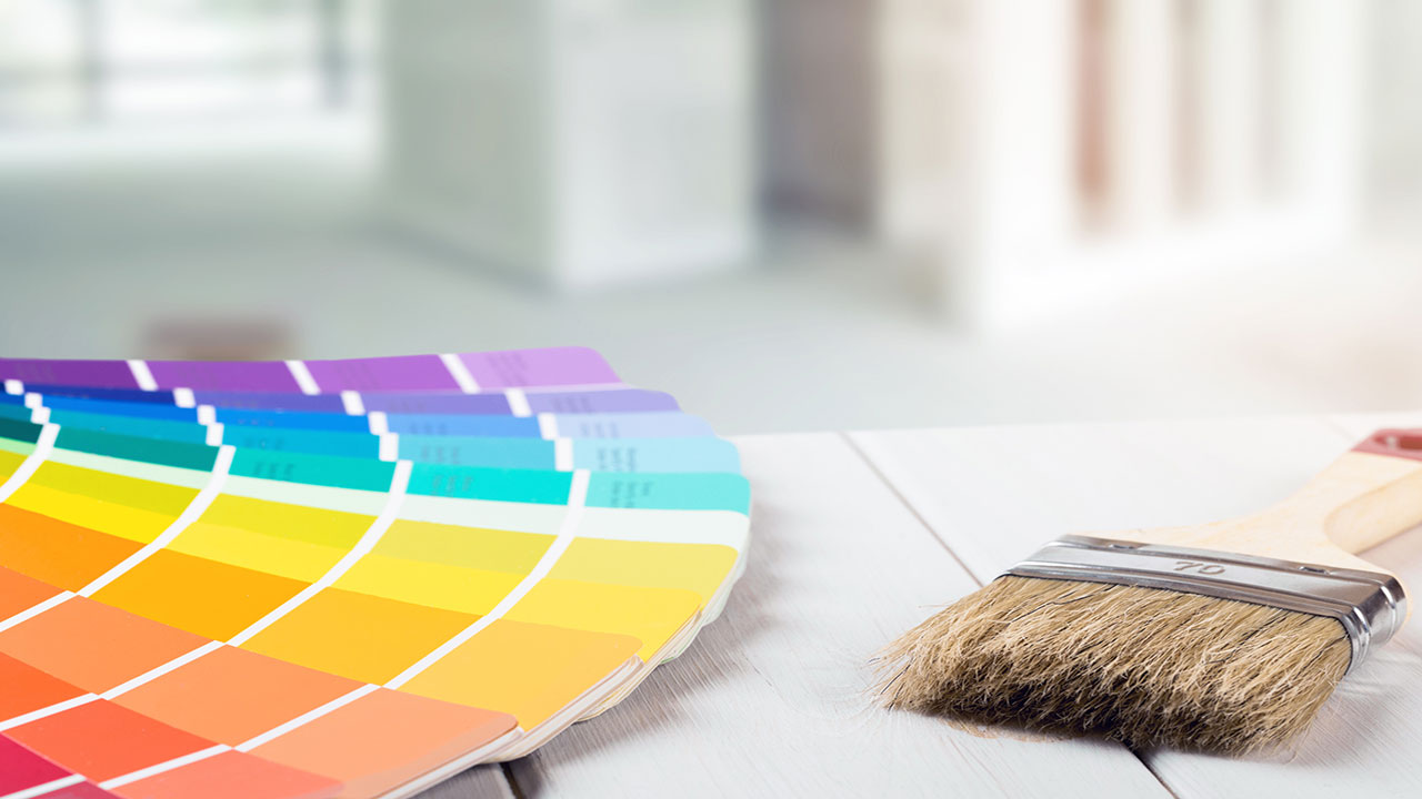
Those are pretty big benefits, so it’s certainly worth it to spend the time, effort, and money needed to stage your home, and a big component of staging is making use of appropriate color palettes.
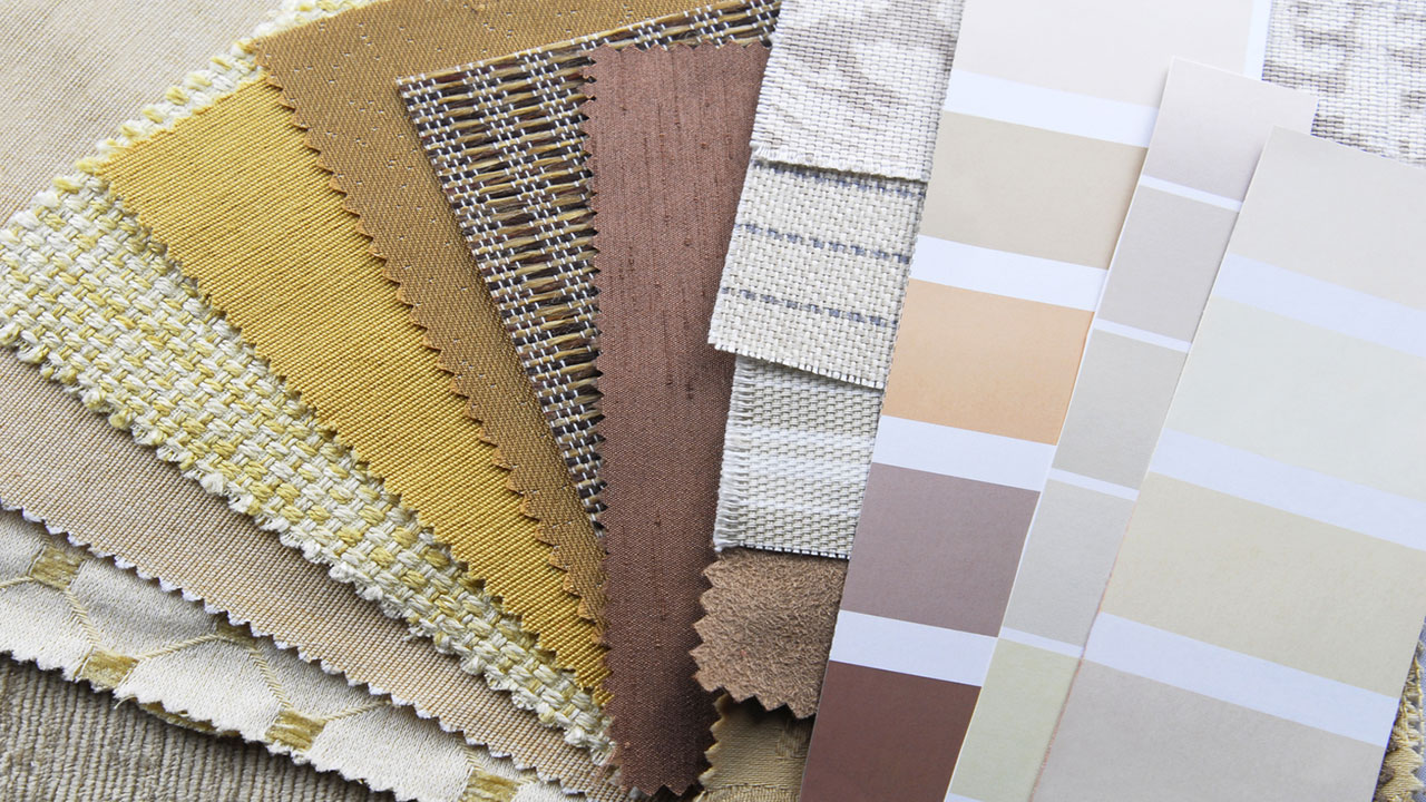
More specifically, the colors that you use to stage your home should be neutral and not overly bold or eccentric. That’s not to say that you can’t use a pop of color here and there with your accessories, but components such as the walls and major pieces of furniture should ideally be neutral in color.
Why Choose Neutral Colors When Staging?
Before we get into the colors that work best when staging, it’s helpful to understand why neutral colors are best used when staging a home for sale.
Here are just some of the reasons why you should stick with neutrals when prepping your home for the market:
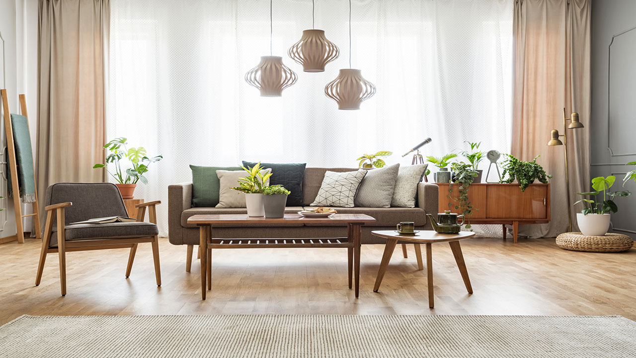
Neutrals showcase furnishings and textures better. Neutral backdrops offer a much more inviting interior when combined with warm furnishings and textures. This allows all components of a space take center stage, rather than distracting the eye with bolder backdrop colors.
Neutrals stand the test of time. Trendy hues like bright orange or electric purple might tickle your fancy today, but what are the odds that they’ll be as attractive in the near future? Neutral hues have a tendency of standing the test of time. Odds are that you – or your buyer – will never get tired of a classic, neutral hue as opposed to others that may quickly go out of style.
Neutrals offer the chance to play with other bold colors. If your walls are already painted in a bright color, adding other bright tones to the space in the form of furniture, accessories, and artwork will just make the room look cluttered and messy. Instead, neutral colors can provide you with the opportunity to play with vibrant hues in terms of throw pillows, blankets, area rugs, and accessories.
Neutral colors will be attractive to more buyers. Perhaps the best reason for using neutral colors in your home is because they’ll appease more buyers on the market. After all, the goal of staging is to make your home as attractive as possible to the majority of buyers out there. With neutral hues, you stand a better chance of prospective buyers appreciating the look of your home as opposed to using much more eclectic colors.
So, what colors work best when staging your home?
Grey
Hardly a boring color, grey is a fabulous neutral tone that you can use in your home when staging. In fact, grey is the “it” neutral color being used for staging these days, as it’s sophisticated and adds a certain amount of elegance to a room.
Gray is subtle yet packs a punch, keeping a home’s interior neutral yet exciting enough to evoke emotions in a buyer. It can serve as the perfect backdrop for just about any color you choose to incorporate into a space as well as any decor style used.
Griege
If you thought beige was a neutral color that stagers still use, you’d be wrong. Beige might certainly be neutral, it’s also a very boring and drab color that’s rarely used in home staging anymore. But mixed with grey, it might still work.
“Griege” is a combination of beige and grey. Actually, it’s more of a grey color with beige undertones. Grey still takes center stage with greige, with beige simply lurking in the background. It’s a great color choice for interiors because it adds some visual interest and brightness without being too bold (or boring).
Navy Blue
You’ll often see various types of blues being used as neutral palettes in home staging, and navy blue is often one of them. Navy blue is sophisticated, grown-up, and opulent in nature and can provide any interior with a neutral backdrop while still infusing visual interest in the space.
If navy is a bit much to cover all walls of a room, you can always use it on an accent wall. This color is the perfect accompaniment to white accents and wood furniture and gives a space a warm and cozy ambiance without being too overwhelming.
Steel Blue
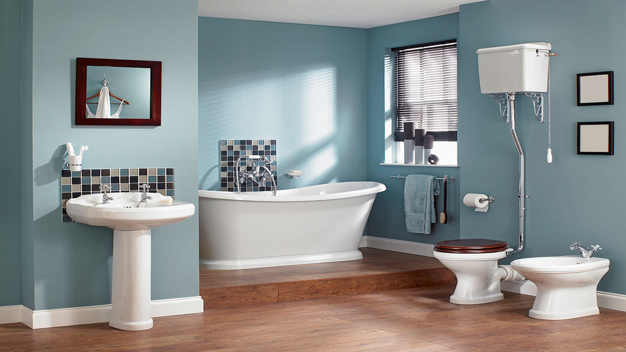
If you like the idea of having blue in your home but aren’t yet sold on going as dark as navy, consider using steel blue. A mix of light- to medium-blue and steel grey, this color is incredibly sophisticated and stylish and can be used as the perfect backdrop in any space.
This is a great option that is characterized by pale blue with subtle grey that is stylish yet warm at the same time. It can offer just the perfect amount of lightness to your home.
Creamy White
White is the quintessential neutral, but the exact shade of white that you use can make a huge difference in the look and feel of your home. Rather than going with stark white – which can evoke a cold and hospital-like feeling – creamy white is much warmer yet still offers some depth.
The Bottom Line
When it comes to home staging, neutral colors are definitely the way to go. You definitely want your home to look stylish, but not necessarily at the expense of turning certain buyers off and limiting the pool of buyers that may find your home attractive. Neutral colors are appealing to more people, and are highly recommended when staging your home for sale.


